Monday, April 26, 2010

Captain Britain Cover art on Ebay.


I have made a conscious decision of late, to not clog up this blog with endless notifications of what I have on Ebay. And although I do intend to continue that, I felt that on this occasion I should mention this particular item... since it has been the subject of two previous posts recently.

The original artwork for the Captain Britain trade paperback cover is currently on offer. This is the inked artwork in it's raw state before I did a little Photoshop tweeking prior to submitting the final art file to Panini. I should have included a scan of the art in this form in my original 'process' post.., but you know what?.. I forgot.

Anyway, here it is, & here's the link to the auction on Ebay.

Labels: , ,

Thursday, April 22, 2010

Wales Film & ComicCon


I'll be appearing as a guest at the Wales Film & ComicCon this coming Sunday. The event takes place at Glyndwr University, Mold Road, Wrexham between 10:00am & 5:00pm. As well as yours truely, there'll be a host of guests from the worlds of comics, & TV & movie fantasy. Click the link for a full guest list.

I'll be doing the usual stints of signing & sketching, & as is now also customary at these events, I will be making a small charge for sketches. I addition to this, I'll be doing a Q&A session on drawing comics for fun & profit... but without the fun part.

Here's one of last year's happy customers, brandishing his booty.. that's in a 'pirate' sense.. not a girls buttocks sense.... jeeze, this post is turning out to be harder work that I'd envisioned..

Just be there, ok? And bring your cash!!


Labels:

Wednesday, April 21, 2010

Captain Britain Trade release date.


The Captain Britain trade paperback for which I supplied the cover art (see a previous post) has a release date, according to Bleeding Cool News. Read the details here. Happily for me, they also have a shot of the final colored art, the first time I've seen it.

Labels:

Saturday, April 10, 2010

Classic 70's Blade: Private Commission.


Here's another post showing something I did last year. This was commissioned by a fan in Germany. As you can see, it's Blade, as depicted in the classic Marvel series 'Tomb Of Dracula'. Unfortunately, it appears I didn't take a scan of the pencil/layout stage, so you'll have to make do with this, the final thing.

If you're interested in something similar, they're now £65 +p&p.

Labels: ,

Friday, April 09, 2010

Quick Roman Legionary Soldier Sketch.


I know, I know.. I'm already slipping with my promise of a regular schedule of posting.... so sue me. Actually... don't... that wouldn't be good....

Aaaaanyhoo, here's a quick sketch I did of a Roman soldier, so in the absence of anything else.... this will have to do. If I get a chance, I'll sling some ink at it.

Labels:

Thursday, April 01, 2010

Quickie Batman Sketch.


This post does exactly what it says on the tin... a quick sketch, made with a rapidly drying up Sharpie..

Labels:

Tuesday, March 30, 2010

Dracula Teasers.


It's been a couple of day since I posted anything, & because I promised myself that this time I would try to update the blog at least once every three days, here's a few selected panels from the upcoming Dracula book (which you will be pleased to hear is almost completed now.. just a handful of pages left..phew). All these are inked with a combination of Sharpies & various other markers/fine liner pens.

Labels:

Saturday, March 27, 2010

Captain Britain Cover.

You may be forgiven for thinking that all I have done recently is covers for Panini trade paperbacks... that's not true, & to demonstrate how inaccurate that is, here's a cover I did recently for a Captain Britain trade paperback... errr... anyhoo...

As usual I was given a list of characters which needed to be included in the art. Due to the nature of these kind of collections, I'm sure the list of actual appearances was vast, but editor Brady Webb condensed it down to the core group.

As you will have seen from previous postes, when faced with this kind of commision, my usual approach is the old 'movie poster' look. However, when I saw the references that Brady supplied me with, the image of the barbarian hoard jumped out at me, so I elected to rip off someone else for a change, & decided to go for a Frazetta-style barbarian rumble.

First of all I did this quick A4 rough to show to Brady. He liked the basic concept, but quite rightly just asked that I move the faces of Cap Britain, Jaspers & The Fury up a little so they wouldn't be so obscured by the figures in the foreground.


While I was making the changes requested by editorial, I decided to change the pose of the Black Knight figure. Rather than do this on the layout, I sketched out the figure seperately, tightened it up & pasted it in using Photoshop.


I submitted this ammended rough, which was approved.


I then printed it out full size, and working on my lightbox, treated it as the pencil stage & went straight to inks. The inks were done with markers & fine liner pens (mostly Sharpies).


Finally, incase some of you may not be familiar with what the inspiration for this was, here's Frank Frazetta's painting 'The Destroyer'. Nobody has ever done barbarian rumbles better than this.

Labels: ,

Thursday, March 25, 2010

More Poster Art.


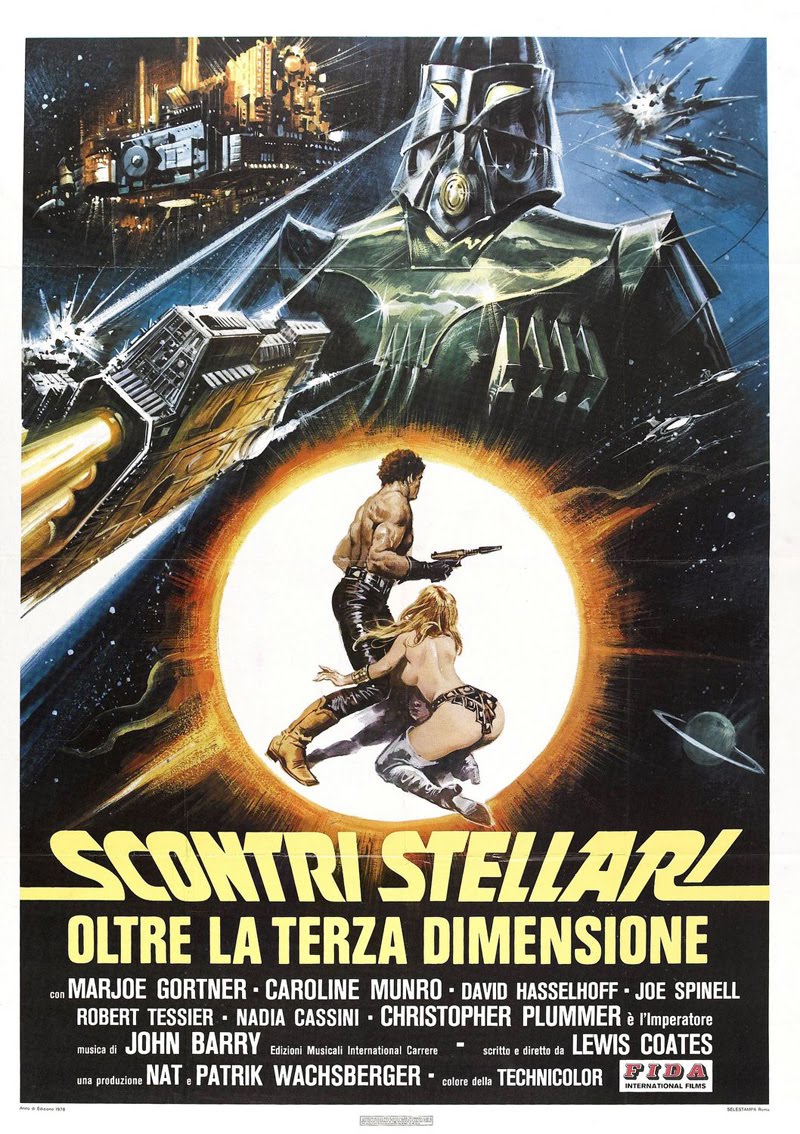
I just wanted to share a couple more of those awesome 1970's movie posters. No, I had nothing to do with these obviously, I just really like them.

Wednesday, March 24, 2010

Marvel Atlas Covers


I mentioned in the previous post a couple of covers I did for Marvel for their 'Atlas Of The Marvel Universe. It was my intention to link the mention to where those covers appeared earlier in the blog. Apparently, I never posted them.. so to avoid any confusion, here they are. As you can see, both of these fall into the 'montage' poster style.

Panini Wolverine & Deadpool covers.

So I mentioned in my last post that this entry was going to be about 1970's montage movie posters... well it is, & it isn't. What I'm showing is a couple of trade paperback covers I did for Panini last year, one for a Wolverine collectuion, one for a Deadpool collection. Since both covers were for books featuring half a dozen unconnected stories, there was a LOT of characters which needed fitting onto the cover art. To my mind, the way this has always been done best is in those montage movie posters I mentioned which were at their peak in the 1970's. This is a style of composition I've used before, most notably on the two covers I did for Marvels 'Atlas of the Marvel Universe' books a few years ago.


Anyway, to the first one of the covers. As you can see there was lots of subsidiary characters that had to be put on the cover in addition to the obligatory 'hero' shot of Wolverine. The only real thing of note in the pencil, is that you will notice I left Logan's claws out at this point, I always knew they were going to be there, & that I wolud add them at the end.


With the Deadpool cover, I was playing around with various idea's for the main character pose..(there's only so many ways you can draw 'character leaping out at the camera' so may times before you get mind-locked) & getting nowhere. When this happens, I take a piece of paper & just fill it with lots & lots of stick figure pose ideas, hoping that one will spark my interest. When one does, I develop that into a more finished sketch. I then scan it into the computer, enlarge it in Photoshop print it out. This was the pose that appealed to me on this project.


Then it was just a matter of fitting in all the rest of the characters, but all the while trying to not make the composition look jumbled or cramped. This was done at a similar to print scale.. so it was easier to take in the whole composition at one glance as I refined it. Once the layout had been approved I again scanned this into the computer & printed it out at the correct size, then using a lightbox, transfered it onto the artboard adding tone & details as I went.


Sometimes I do this stage in ink, treating the layout as the pencil stage, sometimes, like here, I develop a more finished pencil stage first, just to iron out any problems I may feel are happening. Once that was completed, I went ahead with the inks.


With both of these pieces, the trick to a successful cover image in this style lies in the basic composition. With a cover image featuring ten or more characters it would be dead easy to make the image look disjointed & unreadable. This is where (I feel) the beauty of the montage style comes into it's own. It gives the artist the freedom to play with scale. The classic trick is to have one character fill the 'Darth Vader role', which is to say, a large looming presence which oversees the rest of the group, & the main character playing 'Luke Skywalker' (look at the Star Wars poster here to see what I mean).


So , enough of all that bollocks, time to sit back & enjoy some of my favorite examples of the kind of movie poster which influence this style of composition. Honestly, I could do a whole blog about these, I just love the style. It's nice to be give the opportunity to pay homage occasionally in some of the artwork I do.


Labels: ,

Monday, March 22, 2010

Magenta Wilde: #8, #9 & #10


These are the last three episodes of the Magenta strip. The only thing really worthy of note is that in episode 10 I inserted a photograph to serve as my 'pencils' for the hotel lobby background in the first panel. I prefered to do this, rather than insert a photo at the end, at least this way, I only used it as a guide to help me ink the b/g, which made the final result less jarring visually..

Anyway, here they are.. hope you've enjoyed these. Next post... an insightful look into 70's 'montage' movie posters.. no, seriously. It'll rellevant, trust me.